Thursday, 15 January 2015

Ikea: the customer journey from search to checkout and beyond

In which we take a look at the experience of searching for a product, clicking-through to an ecommerce store and purchasing the item, all from a customer’s point of view.

Much like previous investigations on retailers Apple and John Lewis this explores the customer journey in a nutshell, looking at paid search visibility, ad relevancy and the speed and ease of the ecommerce user experience.

This week: Ikea.

Search

Ikea’s Billy bookcase range is the company's most popular product, it sells one every 10 seconds.

Let’s take a look at the search results for ‘bookcase’.
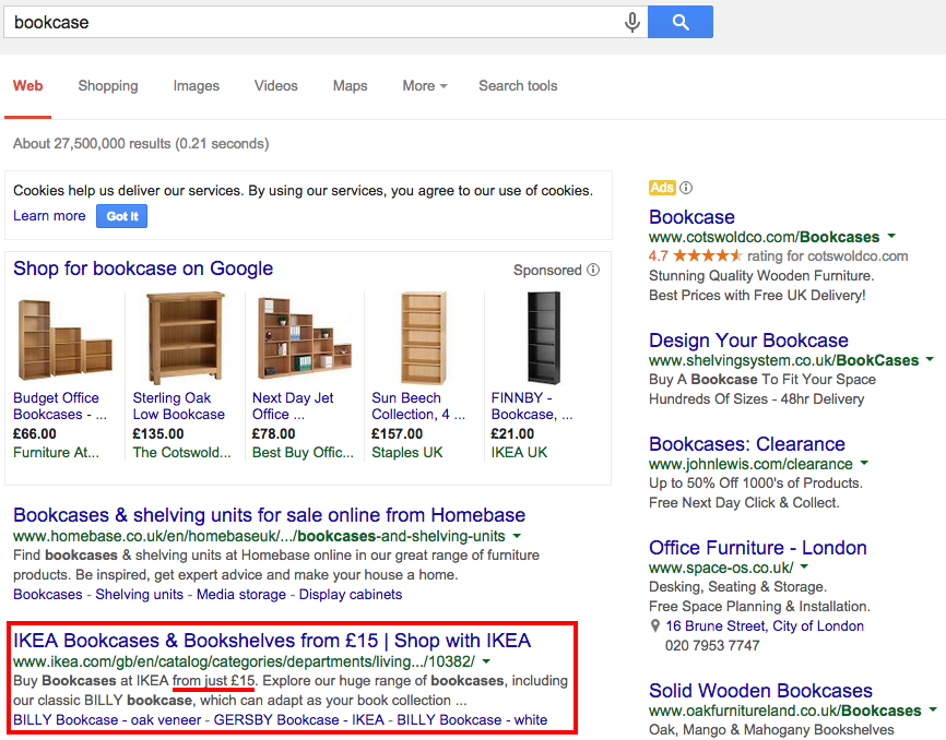
Ikea isn’t currently running a PPC campaign for this, possibly because it feels it doesn’t need to as they’re popular enough, or perhaps as it’s January this might not be the right time of year.

However as Ikea’s listing is below one from home furnishing rival Homebase, perhaps a paid search listing for ‘bookcase’ would position the brand higher within the ad area.

The Ikea listing’s blue link and rich snippet are already optimised well with an attractive and clear price point.

Interestingly Ikea uses Google Shopping (more information on how to use Google Shopping here) and this listing for its Finnby bookcase appears as the fifth ad in the row.

The listing manages to stand out purely because it’s a different coloured product from the rest, and carries a much cheaper price tag.

Let’s try some more popular items, starting with ‘picture frames’.

Although there is no paid search ad or Google shopping listing, Ikea does have the top result in the organic listings. 

However with the sheer number of paid-for listings here, I wonder if its organic result is a little lost. Again it may be worth running a PPC ad just to mix things up a bit.

Here are the results for ‘sofa’.

A Klippan is as ubiquitous as a Malm in homes worldwide, yet here the Ikea listing for ‘sofa’ doesn’t appear until the seventh organic listing. More so than the other search terms, Ikea could certainly benefit from a paid search presence here.

Landing page

Let’s take the Google Shopping listing as our control product. 

Upon clicking the link, the target is exactly what it should be, the relevant product page.

Although the main image doesn’t have options to show the product from other angles as other products here do, there is the ability to click and zoom into any area your mouse hovers over.

There are also colour options, further complementary products and a simple drop down menu that allows you to check availability in your local store for click and collect.

However, improvements could certainly be made below the fold.

The product information text is tiny and the section on the right suggesting alternative products contains images so minuscule they may as well not even be there.

On the plus side though, and most importantly for speed and clarity, the price is clear and the add-to-basket button bright and obvious.

It’s just a shame there’s no information regarding delivery options, charges or returns policy. In fact when you click on the Home Delivery Service link, it brings up a text box, which still doesn’t contain anything useful and the ‘x’ to close the box obscures some of the text.

Once adding the item to the cart, the pop-up box featuring a variety of font sizes and misaligned text doesn’t inspire the most amount of confidence.

Cart

Although there’s a good use of white space here and lack of distractions, the text and thumbnail images again feel inaccessibly small. It seems strange as the blue CTA seems conversely huge and obvious. 

Unfortunately as it’s a non-responsive site, shrinking down the browser does nothing to affect it.

To be positive, any cart information you may require is all here, with options to update quantities, delete the item, continue shopping or move the item back to a shopping list.

Here is also where you can check the delivery costs. Unfortunately the thorny issue of having to put a space in your postcode is present, and as pointless as ever.

Once I’ve entered my postcode correctly, the total cost is updated with the delivery price.

Although there are no options for faster or nominated day delivery, and frankly the £39 delivery charge seems inordinately steep. If there was a threshold for free or cheaper delivery available then you might possibly buy more than just a bookcase. 

Checkout

Thankfully there is an option for guest checkout once you’ve moved on from the cart, which should speed matters up.

Once a customer is ready to buy, they don’t want to have to fill out pages and pages of personal details and create an account before they can make a purchase.

About the best thing I can say about the first page (of four) in the checkout is it has remembered the postcode I entered earlier. 

Unfortunately this is one of the starkest, clinical and fiddily web-forms I’ve seen for a while.

It also automatically opts you in for email marketing and if you want to opt out you have to click through to a different page where you have to enter your email address again.

This is a poor customer experience, which presents a number of barriers (including the tiny text boxes and lack of autofill) before even getting to delivery or payment.

The Delivery Information page is equally as cold and unhelpful at presenting information as the rest of the journey.

Although I can nominate a day for delivery (information not available before this point) it looks like I will have to stay in for 12 hours waiting for the delivery.

Finally when it comes to payment, there are no faster payment options.

Retargeting

One final positive note, two hours later after leaving the site, I received this email informing me of my abandoned cart.

The subject line itself informs me exactly what to expect from opening the email, it’s not too pushy but certainly has a sales focus. 

Perhaps the first cart abandonment email sent soon after leaving a site should be more along the lines of asking if there were any technical difficulties, or if something went wrong with the purchase.

This would put the customer’s needs first and also help obtain useful feedback. Then later they can be sent a more explicit call-to-action.

The content itself is clear, with bright text, good use of space and obvious calls to action. The ‘view basket’ button is always necessary in these emails as it takes potential customers directly into the checkout process. 

However on clicking the button, I’m taken to an empty basket. 

Is this because I used the guest checkout? Perhaps it’s because I clicked through on the email the following day and there’s a time limit on keeping items in the cart?

Either way, if I’ve been sent a basket abandonment email, the items really should still be there, especially after only one day, otherwise it's a complete waste of everyone's time.

In conclusion...

In terms of search marketing, Ikea could certainly do with using a PPC campaign to boost its presence for a variety of terms, however there’s little point in doing this until it’s made significant changes to its ecommerce site.

Although Ikea has been making great strides in connecting its retail stores with digital innovation (the AR enabled catalogue for example), it feels like its checkout process is far from providing an ideal customer experience.

In fact it’s as if Ikea left the process of digital transformation at ‘building a website’ without any further thought for improving the UX through testing and feedback, otherwise it wouldn’t feel so outdated and unpleasant to use.

Last year Ikea came last in another usability test, so perhaps it’s time for the company to commit to a completely focused digital overhaul.

Wednesday, 14 January 2015

Everybody Writes — My Interview With Ann Handley

A few years ago I went to a MarketingProfs event and met someone who literally changed my life. It wasn’t Steve Jobs or Barack Obama or anyone my Mom ever heard of. It was Ann Handley who was speaking on a panel about this up and coming thing called “content marketing.” I fought my social anxiety, walked up to her, and introduced myself. I told her where I worked. And explained that I needed help and advice. I was struggling to help my organization to be more innovative – to agree to change from an outbound marketing approach to one that [...]

The post Everybody Writes — My Interview With Ann Handley appeared first on B2B Marketing Insider.

What is material design? 10 pioneering examples

We published our 17 crucial web design trends for 2015 a couple of weeks ago, and this is the first in a series of posts looking at each trend in a more in depth manner.

This week, the meeting point between flat design and skeuomorphism: material design.

Material design 

Material design is a visual language created by Google. The manifesto that has been set out is an ever-evolving and constantly iterated document, but the fundamentals are fairly clear once you get through the somewhat intimidatingly pretentious language.

Although the ‘synthesizing of classic principles of good design with the innovation and possibility of technology and science’ does have a certain optimistic charm to it.

The overriding goal is to develop one system that allows for a unified user experience across all devices, platforms and screen sizes.

The general rule is that mobile functionality (swiping, tapping) should be primary, but mouse, keyboard, touch and mouse must be as important. 

Material as metaphor

To quote Google:

The material is grounded in tactile reality, inspired by the study of paper and ink, yet technologically advanced and open to imagination and magic.

So basically it’s not quite the wholesale junking of skeuomorphism like we might have expected, but it’s a significant step into a whole new visually representative language.

Skeuomorphism is quite simply the practise of making something artificial appear real and the most famous modern example of this can be found in the iPhone’s yellow papered, ring bound Notes app and the rickety-bookcase-aping Newsstand app.

Since the introduction of iOS7, this design trend has become more and more unpopular, and quite right too.

Most of us have been interacting with the digital world for half our lives now, we no longer need the patronising comfort of a button on a digital screen to look exactly like a button in the real world. The faster we consumers get used to this, the faster digital design can move forward.

However within flat design there is a tendency for buttons to disappear into the background, forming a seamless wall that can leave the user bewildered and frustrated that they can’t find functions that aren’t clearly defined, especially if they don’t have any previous experience with the interface.

This is where material design comes in. The surfaces and edges of elements in material design provide visual cues that are grounded in reality. Realistic lighting also helps to define objects and divide space.

The use of familiar tactile features also helps users quickly understand the relation between an object and its environment. 

Bold intentional graphics

The principals of print based design are not only there to appear visually attractive but also to guide your experience using hierarchy, meaning and focus.

Bold solid colours, sharply defined edge-to-edge imagery, large-scale typography and intentional white space helps to create an immersive user experience.

Meaningful motion

User actions are the primary focus, the person interacting with the design controls the experience rather than the other way round.

Action should also take place in a single environment and interactive objects should be presented to the user without breaking continuity even as the experience changes.

There is vast amounts of information on the Google Design website going into greater technical detail with regards to environmental properties, 3D design, animation and responsive interaction, so if you’re interested do check it out.

Examples

In the meantime, I’ve rounded up some current examples of material design.

(Some of these examples are courtesy of Thomas Vanhoutte and Stanfy.)

Gmail Inbox

For more information check out our review, Gmail Inbox: does email need a reboot?

Calculator

Message sent

Newspaper

Player interface

Events listings

Flight information

Music player

Phone contacts

To do lists

Further reading

For more on web design from the blog, check out our crucial web design trends of 2015, also these 14 joyful examples of micro UX and 20 examples of beautifully persuasive ecommerce design

15 Ways You Can Beat The Content Marketing Odds

Want your content read? Here are 15 ways you can beat the content marketing odds. Translation: get your content in front of and read by your prospects.

The post 15 Ways You Can Beat The Content Marketing Odds appeared first on Heidi Cohen.

21 examples of retro design that made a comeback online

There is nothing new under the sun. So spoketh Solomon and/or Shakespeare, depending on who you believe.

Either way, it’s unlikely they were referring to web design, but as we enter into an uncertain future, there’s no denying there’s a strange comfort in nostalgia - Hey, look at hipsters for starters.

Everywhere you turn online we’re confronted with roaring 20s typeface, swinging 60s splash pages and... erm... Bronze-age breadcrumbs. 

These aren’t necessarily the newest, or even greatest examples of retro design, but each had a range of elements both subtle and strong that I felt showcased how design can influence story and branding. 

With this in mind, here are some great examples that I hope will inspire your own online vintage makeovers. Click on the images to head to each site. 

Burger and Lobster

https://assets.econsultancy.com/images/resized/0005/8121/burger_and_lobster-blog-flyer.png

Let’s start with this from the London (and now NYC) based purveyors of quality crustaceans.

A lovely ‘one-sheet’ site filled to bursting with drawings that may be meant to recall Scarfe, but to my mind summons up classic Disney. It’s an unusual and refreshing approach to navigation, so kudos for not disrupting the UX.

Dishoom

https://assets.econsultancy.com/images/resized/0005/8124/dishoom-blog-flyer.png

Dishoom’s website takes the restaurant’s ‘faded opulence’ vibe and runs with it, with plenty of retro filters and colour choices lending a 1960s feel that works well with the smooth transitions. 

Bold & Noble

https://assets.econsultancy.com/images/resized/0005/8119/bold___noble-blog-flyer.png

Retro design is certainly easier if you sell retro products, and this is a great example of web design reflecting the inventory, with lots of snazzy fonts aiding the handmade feel. 

Moncada Brewery

https://assets.econsultancy.com/images/resized/0005/8132/moncada-blog-flyer.png

I’m quite a fan of craft beer, so I spent a while searching through the sites of Siren, Beavertown, 5 Points and more before happening on Moncada’s home page, which blends Victorian styling with modern flourishes – not unlike the brewery’s home in Notting Hill. 

Clutch

https://assets.econsultancy.com/images/resized/0005/8123/clutch-blog-flyer.png

A tiny site, but some lovely elements in just the right places, with minimalist artwork designed to replicate wooden cutouts. The chicken is pretty tasty too. 

Small Stone Records

https://assets.econsultancy.com/images/resized/0005/8140/small_stone-blog-flyer.png

Long-time supporters of the New Wave of American garage rock, Small Stone Record’s site positively drips low-slung 70s eight-track cool. Come for the design choices, stay for the amazing jukebox. 

The New York Moon

https://assets.econsultancy.com/images/resized/0005/8133/moon_radio-blog-flyer.png

An oldie but a... erm... ‘silvery’, unique publication NY Moon holds the spirit of Tesla close to its heart, with verbose copy half-ripped from ‘popular mechanics’ and some great cut 'n' paste electronic imagery. 

People’s Park Tavern

https://assets.econsultancy.com/images/resized/0005/8138/peoples_park_tavern-blog-flyer.png

Technically this is a Tumblr, but I’m throwing it in as it has some great pointers to help you create your own retro content (and happens to be around the corner from my house).

The pub revels in its hipster location, filling pages with filtered images of the in-house brewery and tilt-shifted images from the garden for always-on nostalgia. 

Omni Magazine

https://assets.econsultancy.com/images/resized/0005/8136/omni-blog-flyer.png

Omni’s reboot site features an entirely different kind of retro – the future, or at least, the future we imagined in the past.

Gorgeous artwork aplenty, and a cast-chrome guarantee of at least one petulant robot per issue. 

Tennessee Vacation

https://assets.econsultancy.com/images/resized/0005/8141/tennessee-blog-flyer.png

A travel site with a unique combination of down-home typography, and whisky-drenched imagery encouraging you to partake in country music, bourbon and rolling hills. 

The Ginger Pig

https://assets.econsultancy.com/images/resized/0005/8146/ginger_pig-blog-flyer.jpg

A quality butcher that makes sure everything it does reflects heritage, from its pig breeds to its website. Swirly type, charming old paintings and lots and lots of storytelling support the excellent sausage rolls.  

Camp Bestival

https://assets.econsultancy.com/images/resized/0005/8118/bestival-blog-flyer.png

Britain’s cosiest festival makes up for what it may lack in rock 'n' roll excess in multi-coloured joy. A circus of images push its family-friendly theme to the fore. 

La Bodega negra

https://assets.econsultancy.com/images/resized/0005/8131/la_bodego_negra-blog-flyer.png

A feast for the eyes as well as the belly, La Bodega Negra makes fine use of vintage photography to up its dangerous, drag racing, hell-raising heritage and encourage you to nip in for a mezcal cocktail or three.

J. Peterman

https://assets.econsultancy.com/images/resized/0005/8130/j_peterman-blog-flyer.png

More a case of ‘stayed with us so long that it became retro’, J. Peterman’s predilection for effortlessly cool 1960s draughtsmanship to showcase its products manages to be timeless, even if you can’t shake the feeling that Elaine is writing the copy

Glazed & Infused

https://assets.econsultancy.com/images/resized/0005/8126/glazed-blog-flyer.png

I’ve so far (just) managed to avoid any cupcake sites in this round-up, so you’ll forgive me if I include donut-masters Glazed & Infused.

A nice combo of modern Pinterest-and-flat-design influence with a vintage touch. 

Anthropologie

https://assets.econsultancy.com/images/resized/0005/8117/anthropologie-blog-flyer.png

The more I look at Anthropologie’s site, the more relaxed I become. Honey-dipped photography, swirling, hand-written fonts and a liberal sprinkling of language that appears to be plucked from an Agatha Christie novel all add up to a luxurious ecommerce experience.  

Bombardier

https://assets.econsultancy.com/images/resized/0005/8120/bombardier-blog-flyer.png

Channelling the spirit of Flashman, Bombardier has some great images, and a playful, over-the-top tone of voice that forces you to read it in a shouting sergeant-major voice. Bang on indeed. 

Hawksmoor

https://assets.econsultancy.com/images/resized/0005/8127/hawksmoor-blog-flyer.png

While it may not be the most complex site on the list, Hawksmoor manages to cram in lots of little details that just work.

Some lovely fonts, informative video and a range of t-shirts that I can’t imagine anyone actually ever wearing combine to give off a handcrafted feel throughout, like a friend just drew the location map out for you. 

Cirq

https://assets.econsultancy.com/images/resized/0005/8122/cirq-blog-flyer.png

Another example of the crafted look and feel, with hand-stamps and individual signatures reminding you of how much love and attention must go into every bottle.

The California winemaker succeeds in combining subtle design with storytelling to deliver its message effectively. 

Second Life Festival

https://assets.econsultancy.com/images/resized/0005/8139/second_life-blog-flyer.png

Given that it’s a vintage festival, it’s no surprise to see the design choice made by Second Life Fest, but it’s still well-executed, with elements of collage, classic film clips and plenty of kitsch telling you exactly what to expect. 

Everyman Cinemas

https://assets.econsultancy.com/images/resized/0005/8142/everyman-blog-flyer.png

It’s surprising how many cinemas cast aside movie history in favour of selling you another mega-gulp and nacho combo, but fortunately Everyman remembers and loves its heritage, with the glamour of vintage Hollywood perfectly positioning the brand as the ‘film-lovers choice’. 

BONUS! Scarfolk

Not technically a designed site, but brilliant and disturbing in equal measure. 

https://assets.econsultancy.com/images/resized/0005/8153/mindcontrolwww-scarfolk-blogspot-com-blog-flyer.jpg