Monday, 29 September 2014

How First Direct handles social customer service

It matters little whether you’re a shoe retailer or an online bank, if your brand operates a social channel, consumers will want to talk to you on it.

As I discovered in last week’s investigation into how 20 top UK retailers handle social customer service, the most successful brands are the ones that are not only quick to respond, but also genuinely helpful and clearly written with personality.

This is all well and good in retail, where perhaps it’s more acceptable to adopt a more relaxed, fun tone of voice, but how difficult is it for a financial services brand to not only maintain an efficient customer service channel that fully complies with banking regulations that’s also human?

Today I talked to senior communications manager Amanda Brown at First Direct to gain some insight into how the online and telephone based bank handles customers on social. 

Afterwards check out my own investigation into how 16 retail banks handle social customer care.

Can you tell us what you feel are the benefits of providing social customer service? 

One of the key benefits has to be that it offers customers a quick and easy way to have their questions and issues answered. On most occasions a query can be answered with no need to call or log onto internet banking to send a secure message. The majority of tweets received are answered in less than 15 minutes, 24 hours a day. 

Do you think customer care should extend across all social channels? 

Personally no because an organization would need to ensure that they can explore a conversation with a person within a social space, not all sites such as snap chat would permit this. 

Do you think customer service teams need specific training on how to deliver customer care on social? Do you think the same team should handle all enquiries regardless of channel? 

Training is vital for anyone handling queries via social media not only to ensure consistency in the service being provided but also consistency in brand tone so a customer know they're talking to first direct whether they're calling us on the phone or contacting the bank in social channels. 

It's essential that responding teams are passionate about giving customers a great experience every time they contact you however, there are different skills associated with responding in different channels so our teams currently don't handle calls and digital channels at the same time. 

At first direct do you have an optimum time for responding? Is there a certain tone of voice, or adherence to personalisation that your team is required to adopt? 

We always put quality over quantity and promote this across the team and so don't have a target to respond to a tweet. We do however expect that every tweet to be handled on average within 15 minutes and on most occasions the average response time is 10 minutes. 

The responding team all adhere to our brand guidelines, this ensures that the team responds and represents the brand for what we stand for. Just like a telephone call we love to build rapport with our customers and show our human side. 

How do you handle more sensitive enquiries (such as ones where account details and security info is needed)? Do you find that customers mind being moved to a different channel for this?

When we have to speak to a customer about more sensitive topics we take them offline and ask them to send us via email their name and postcode so that we can locate them on our systems and call them back. Our Bio on twitter states that we will never ask for any bank details and may only ask for name and postcode, this manages expectations from the outset. 

We do find that the majority of customers understand why we need to take them offline and are happy to be called by us. We find this is well received mainly because we explain our reasons for doing so. 

We make it clear that the same person who has tweeted them is the same person who will call them back, we ensure that it is clear we are taking ownership for the query through to resolution which helps the transition from twitter to telephone.   

Do you have any best practice tips for other companies wishing to improve their social customer service?

We have found that a quick response with a genuine human approach to help and service is the best way to help. We have built a strong service reputation, which means pulling out all of the stops to help our customers.

Training is key; we spend lots of time with our team ensuring they are confident to handle any queries. We have seen great results from training provided. Investing this time pays dividends to the service our customers receive.

Taking ownership is also good practice, if we receive a query that we are not able to easily resolve we will assign this to one person who will see this through to resolution.

Here at first direct we have a “no machines” approach, social customer service is no different. We do not copy and paste any content for our tweets and we make sure that all of our replies are bespoke to a customer query. Treating every tweet with a human touch, genuine warmth and showing that we care is key to the success of our resolution.  

For more insight, find out what social customer service is really worth in statistics.

How conflicts between sub-domains can harm your search rankings

Brands have sub-domains for a variety of reasons - to separate their sites for different audiences, to split their offerings, and so on. 

However, this can lead to conflict between the main and sub-domains if this strategy is not applied properly. 

Before Google ended clustering in search results, this may well have worked well for brands, allowing them greater visibility in search results

In this post, I'll show these sub-domain conflicts are affecting Ladbrokes, Coral, Oasis, ASOS and Barclay's. 

Sub-domains and gambling sites

Several gambling brands have sub-domains for their various products. In this case, Ladbrokes has sub-domains for casino, sports betting and poker. 

However, these different domains (and departments) seem to be competing against each other for search rankings. 

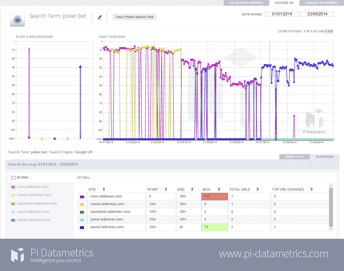
This has harmed Ladbrokes' search positions, as the chart shows. Having ranked on the first page for the first few months of the year, it's rankings have fluctuated and now it's on page three for 'poker bet'. 

(Click image for larger version)

We see something similar on this chart, for the keyword 'place bet'.

It's a very broad phrase, and could therefore be relevant to several of Ladbrokes' sub-domains. This chart shows six sub-domains competing for the term. 

As you can see, they all can't rank at once, so they're almost taking turns to be the Ladbrokes URL returned for that search. 

This is no good for any of them, and Ladbrokes needs to decide which page it wants to rank for that phrase. 

(Click image for larger version)


Here for 'horse racing newbury' Coral's news pages are competing with its betting pages for the term. 

Presumably, Coral would rather direct search traffic to a page where they can bet straight away, rather than news articles. 

(Click image for larger version)

It's the same for 'Goodwood betting', a very valuable term to rank for. 

Here, conflict between the homepage and news pages means that rankings for the term have fluctuated wildly. 

Indeed, the news pages seem to have been more popular with Google, the reverse of what Coral would want.

For the Glorious Goodwood meeting at the end of July, which is when Google searches for this term peak every year, the news site was the highest ranking of Coral's pages. A missed opportunity. 

(Click image for larger version)

Again, we have the news site competing with the betting pages for the term 'Chelsea bet'. 

(Click image for larger version)

For Ladbrokes and Coral, these conflicts between sub-domains are harming search rankings for some very valuable keywords, which indicate an intent to purchase on the part of the searcher. 

A look at the keyword estimates from Google's AdWords Planner shows the value of these terms: 

Page one is the place to be to pick up this traffic, so Ladbrokes and Coral will be missing out by lingering on pages two and below for terms they are capable of ranking for. 

This lack of organic visibility may well be the reason that Ladbrokes is paying for PPC ads on most of the above terms, while Coral is also there for 'chelsea bet'. 

At £26 a click, Ladbrokes and Coral's sub-domain conflicts are costing the companies in terms of PPC spend and missed organic leads. 

Banking sites

Switch banks is a valuable term, £5 upwards according to Google. 

The chart below shows the conflict between 'Ask Barclays', its Q&A pages, and the main homepage for the term. 

As we can see, the homepage was happily ranking on the top two pages of Google between January and May this year. 

After this, the Ask Barclays pages are playing havoc with the homepage's search positions, forcing it out of the SERPs most of the time, and ranking much lower itself. 

I'm not sure what happened on May 1. Perhaps Barclays launched 'Ask Barclays' or placed it on that sub-domain.

Whatever the reason, though the content may be useful, it hasn't helped the bank's broader SEO strategy. 

(Click image for larger version)


In this example, Barclays' online banking start page is interfering with the homepage's rankings for the term 'banking'. 

(Click image for larger version)

Sub-domain conflicts from fashion sites

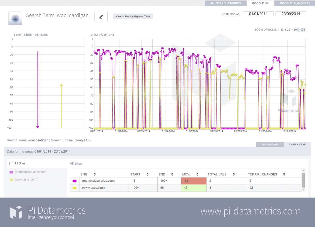
Here, the ASOS marketplace site seems to be outdoing the main site for 'wool cardigan' and the overall effect seems to be that both are brought down the rankings for the term. 

Having started out at 16 in Google, ASOS now ranks at 56 for this term. Essentially, only one site can rank for the term, so ASOS needs to decide which one is more important. 

(Click image for larger version)


Here, it seems to be a tag page which is interfering with Oasis' rankings for 'red cardigan' 

It's not a page the company would want to lead searchers to. Though the homepage would be better than this, Oasis would surely want to rank for a product or category page instead.  

(Click image for larger version)

So how do sites resolve these sub-domain conflicts? 

The answers are varied, and will depend on business goals.

For example, Ladbrokes may have different betting sub-domains as this helps it to measure the ROI for each department, while Coral has launched a news site, which is great from a content marketing perspective, but it hasn't considered the SEO effects.  

According to Sam Silverwood-Cope from PI-Datametrics:

There's lots of different types of sub-domain conflict here and ultimately it is the same as internal cannibalisation. It's down to appropriate sign posting, snippet content, theming, internal linking, communication between departments and having a coordinated strategy. If you walked into a shop and saw that "womenswear" was on the 1st floor and on the 5th floor, the shopper would be confused. Plus one of those areas would get more custom than the other. This is the same with a site and how Google responds to it. 

It also seems a relatively naive tactic for separate sub-domains to constantly attempt to perform for the same search term as a different department, eg "Poker" without at anytime thinking "maybe we should consolidate our efforts?". If sites want their audiences to see their different departments, then why not have easy access between folders? If they don't then perhaps the companies should have different URLs, with unique content and theming. 

There is a common theme here, and it's that sites can only rank on Google for one landing page per term.

They therefore need to decide which landing page is more valuable to them, and provide clear indications to Google to implement this. 

How 16 retail banks handle social customer service

Last week I conducted an investigation into how 20 top UK retailers handle social customer service. It was a fascinating insight into the world of Twitter customer care and revealed just how a consumer’s experience can vary from brand to brand.

This week I’m turning my attention to retail banking. 

Earlier today I interviewed First Direct’s senior communications manager Amanda Brown and learnt some best practice tips as well as guidance on what to expect from aiming a Twitter enquiry towards a bank.

Will I experience the same level of personality as I did with non-banking retail brands? Will I have to be taken to a more secure channel? Will the banking industry just be too busy to answer my question?

Let’s find out…

Quick, helpful and personal

Which of the banks responded within 15 minutes, answered my query satisfactorily and added a personal touch?

HSBC – 3 minutes

TSB – 4 minutes

Nationwide – 5 minutes 

Really quick response, although if I’m being really picky it’s not as personable as the other examples here.

M&S Bank - 5 minutes

M&S answered me promptly and asked me what type of account I was referring to, as I had forgotten the information in the original tweet. 

Virgin Money – 9 minutes

First Direct – 12 minutes

NatWest – 12 minutes

Co-operative Bank – 16 minutes

I’m including Co-operative here because it was only one minute over my own benchmark and it was helpful and friendly enough.

Under an hour and spookily similar

These all came in under an hour, which is about the maximum time that I would consider good customer service on Twitter. Do you notice something familiar between these tweets?

Halifax – 41 minutes

Lloyds – 44 minutes

Bank of Scotland – 44 minutes

All roughly sent the same time. All written in the same format. Two of them written by ‘LB’. Is it possible Halifax, Lloyds Bank and Bank of Scotland are using the same customer service team?

Bottom of the league

Here’s a round-up of the banks that could do better.

Barclays – 1 hour and 2 minutes

Just slipped over the one hour window, but full marks for personalisation and helpfulness nonetheless.

Citi – 1 hour 24 minutes

I love the enthusiasm here, but unfortunately it looks like Citi doesn’t operate a Twitter customer help channel for UK customers and therefore I have to call a helpline.

Santander – 5 minutes

One of the quickest here, but with other banks being able to offer me this information this tweet seemed fairly unhelpful. Perhaps if Santander had thought to @mention NatWest itself then this would’ve been better?

Tesco Bank – 36 minutes (and then some)

Tesco did great in telling me that it has acknowledged my tweet and is looking into it. Without realising it, I had used a specific Tesco Bank 'news' Twitter handle. I was told that somebody from the main account would come to my aid, however as I write this four hours later I have still to hear back.

Sainsbury's Bank

Sainsbury’s Bank seems to be the only UK retail bank that doesn’t operate a customer service channel on Twitter. There is an account for Sainsbury’s Bank but it acts purely for providing press releases and news for journalists.

Any customer enquiry is met with this response…

Statistics

Which banks operate a separate customer service channel from the main Twitter account?

86% (14 out of 16) banks operate a specific customer service channel. Sainsbury’s doesn’t and all of Tesco’s enquiries are done through the main Tesco Twitter account. Although I’ve yet to see a result from this.

Which of these banks publish their opening hours in their profiles?

75% (12 out of 16) publish their opening hours. M%S Bank, Virgin Money and Tesco could all do with making this small change to their profile descriptions.

Which of these banks state that you may be required to use a more secure channel to complete an enquiry?

19% (3 out of 16) state that users may need to adopt a different channel, congratulations to HSBC, M&S Bank and First Direct for being in the minority. Many of the banks however do state that you should never tweet your bank details to them.

What have we learnt?

The most encouraging stat to come out of this entire exercise is that 100% of all the banks I contacted responded within 90 minutes and half of those were under 15 minutes.

The retail banking industry seems to be leading the way with social customer service. Only a handful need to make small changes to their profiles and perhaps one or two could have a touch more personality. 

However for the most part it’s incredibly encouraging to see such great commitment to customer service from one of the more serious sectors on one of the newest platforms.

To learn more about social and all things digital come to our Festival of Marketing event in November. A two day celebration of the modern marketing industry, featuring speakers from brands including LEGO, Tesco, Barclays, FT.com and more.

Content Marketing: Original Versus Curated Content 

Having the original versus curated content debate? Here's research to help you. Advantages and disadvantages of original vs curated content are presented.

The post Content Marketing: Original Versus Curated Content  appeared first on Heidi Cohen.

Hamburger menus for mobile navigation: do they work?

Hamburger menus are ubiquitous in mobile web design, but the jury is out on whether the little three-lined icon actually works.

A lot of people hate hamburger menus because they feel not everyone knows what it means and that menu options are hidden from view.

However much of the negative feeling seems to be based on a vague notion that the icon harms the user experience, without any actual evidence to back it up.

Last week Booking.com released the findings of its own study into the use of hamburger menus and it turned out to be good news for fans of the three-lined icon.

I’ve summarised the results below along with the results of several other studies into the uses of hamburger menus, so you can make up your own mind.

For more on this topic, read our posts on 14 inspiring mobile commerce websites and 11 ways to improve the navigation on your mobile site.

Booking.com

Travel site Booking.com ran an A/B test to see whether the use of a hamburger menu harmed the user experience in anyway.

Having previously tested different variants of the icon (e.g. with a border, without a border, different colours) it was decided to see if the word ‘menu’ proved to be more user-friendly.

The original hamburger menu looked like this:

While the variant looked like this:

Both versions were exposed to millions of users around the world, in every supported language and across a variety of devices.

The results... Booking.com found that changing the icon to the word ‘menu’ had no significant impact on user behaviour. So there you have it.

The sage advice from the blog’s author:

What works for Booking.com may not work for you and your users. This is the reason we A/B test in the first place, because the findings of others, be they expert opinion, data from other websites, or hypotheses dreamt up in the pub while eating a hamburger, are all unproven until they’ve been tested against our customers, on our platform.

Exisweb

Web developer James Foster conducted the same test as Booking.com – a hamburger menu vs. the word ‘menu’.

The test ran for five days and was served to around 50,000 mobile visitors who were predominately aged under 35 and using an Apple device.

But in this test there were four different variations:

1. Bordered hamburger menu (Original, baseline design)

2. Bordered ‘menu’ button

3. Bordered icon with both hamburger and ‘menu’

4. ‘Menu’ with no border

These are the results, which show that the word ‘menu’ was clicked significantly more often than the hamburger menu, but only when it had a border.

But just because it achieved more clicks, does that necessarily mean it improved the user experience?

As James notes, it could be that the ‘menu’ button simply draws more attention.

Exisweb 2

In another A/B test James Foster trialled this bordered hamburger menu:

Versus this bordered ‘menu’ button:

The A/B test was run among 240,000 unique mobile users, with results showing that the ‘menu’ button was clicked by 20% more unique visitors that the hamburger button.

Interestingly, the difference was even more stark among Android users.

Those using iOS devices clicked the menu 0.77% of the time, while on Android this fell to just 0.27%.

James does note several caveats with this study, namely that the results are only from one website and that it only measures clicks on a webpage rather than intent.

Zeebox

Zeebox is a mobile app that works as a dedicated social network around TV. Its CTO Anthony Rose wrote an excellent article on The Next Web where he detailed the company’s experiment with a hamburger menu.

It should be noted that this example is slightly different to the other case studies, as it involves a side menu (also known as 'navigation drawers'), so the hamburger icon was only partially visible in the top right of the screen.

Also, Zeebox is an app whereas the other examples are all from mobile websites.

But anyway, Zeebox initially had its menu options as tabs across the top of the screen, but the decision was made to switch to a hamburger menu as it was felt that this looked cleaner.

These are the two designs:

It seems like a simple change, but in fact Zeebox found that engagement time was halved, with the conclusion being that it was a simple case of “out of sight, out of mind.”

Or to put it differently, users need to be shown the different options available to encourage them to click on things and play around with the app.

To validate these results Zeebox ran an A/B test where 15% of users saw the side navigation and 85% saw top navigation.

The results... weekly user frequency, daily frequency and time spent in app all decreased.

Friday, 26 September 2014

13 large hairy things that landed on our shores and pillaged our internet village this week

By the hoary host of Hoggoth, welcome weary traveller, to our hall.

Me and the internet have decided that retro is very on trend, so we’ve decided to begin dressing in the manner of 12th century Viking invaders. It’s certainly livened up board meetings we can tell you. 

That has nothing at all to do with this week’s miscellany of idiocy from around the web, as you’ll soon see… 

What I really want is a man who is HIDEOUSLY rich...

Yeah yeah, you think you know about web design. Unless you’re taking tips from ‘world’s celebrated business tycoon’ (which world isn’t mentioned) Prince Moosa, YOU KNOW NOTHING. 

Click the Prince's throne for a lesson in website design you'll never forget. No matter how hard you try. 

https://assets.econsultancy.com/images/resized/0005/4274/prince-blog-full.png

So realistic, it'll drink your leftover champagne. 

How often have you been at work and needed to construct a tiny green model of the Ghostbuster's second-fattest foe? I'm betting daily. Well worry no more! CAUTION: May contain an actual real live ghost: 


Literary references, but, y’know… for kids.

Some absolutely luvverly art from the very talented Ben Chen. Pop-Up Pirate is a particular fave:

https://assets.econsultancy.com/images/resized/0005/4277/godfather-blog-half.png  

Anything is possible

I slip a reference to this website into as many blog posts as I can, but frankly I’m still utterly astounded at the lack of people making use of the web’s most comprehensive resource.

You can quite literally do anything at Zombo.com. Anything at all. Speakers on please. 

https://assets.econsultancy.com/images/resized/0005/4278/zombo-blog-full.png

 MEAT SOX

 I may live in London Fields, but I’m seriously gonna have to up my game. My lemon-yellow doily-cape just isn’t gonna cut it against this kind of competition. 

Things on my desk right now:

  • A miniature Bat-Signal.
  • A small golden cat.
  • Two luminous 80s sweatbands.
  • A notepad with the words ‘’Wat Gwan?’ written on it in purple sharpie.

But I couldn’t live in this paradise of functional simplicity if it weren’t for modern technology, as this superlative little film shows. 

The joy of spaaaaaace

Parallax scrolling always sounded like something from outer space to me anyway, which is what makes this such an absolute joy.

Go on, waste an hour on it: 

https://assets.econsultancy.com/images/resized/0005/4280/spaaace-blog-full.png

Throw me the whip signor

Dun-da dun duuun, dun da-dun, dun da dun dun, dun da dun dun dun. And so on and so forth.

Raiders of the Lost Ark is absolutely brilliant. From Himalayan drinking competitions to Nazis with exploding heads, it’s got everything I look for in a film.

What you might not realise is just how brilliant the staging is. Steven Soderbergh does though, so he’s re-cut the whole thing as a black and white silent film. If anything, it’s even better...

https://assets.econsultancy.com/images/resized/0005/4281/indy-blog-full.png

I be all up in ur air, deliverin' ur amazons

When we think of our autonomous flying machine-friends, we’re usually thinking about sleek killing machines, or possibly those annoying quad copters that smack into your head in the park.

But there is a kinder, gentler side to drone tech too. One that... just... wants to... Daaaaaaaancceeee...

Dog corner

Woof! Bark! Grrrr!

What’s that boy? You’re not sure if you’re a Wetterhorn or a King Charles?

And you need to find out in the most adorable way possible? You got it, let’s check out Lili Chin’s complete guide to canines. Click the image for adorableness overload.

Woof Woof! What’s that? Timmy’s stuck down the well again? Ah, the hell with that kid, that’s the third time this month. 

https://assets.econsultancy.com/images/resized/0005/4282/dogs-blog-half.png

Doge corner 

So cool. Very relax. 

https://assets.econsultancy.com/images/resized/0005/4283/doge-blog-half.jpg

Setting realistic social media goals

Remember not to fill up your followers' social feeds with too many updates kids. 

https://assets.econsultancy.com/images/resized/0005/4284/xrevhmj-blog-half.jpg

Malkovich? Malkovich!

The original Hodor proves that he’s an artist dammit! Click for some genuinely unsettling images.

https://assets.econsultancy.com/images/resized/0005/4285/malko-blog-full.jpg

Right, that’s it for this week. As promised, not a Viking in site.  

Me and the internet are off to rustle cabbages from Farmer MacGregor’s garden. I can’t imagine anything going wrong. See you next week!  

Five of Econsultancy's best infographics from 2014

Here's a round up of infographics, which we've created to accompany some of our survey reports this year. 

The topics we've covered include cross-channel trends, budgets, data-driven marketing and essentials skills for modern marketers.

Enjoy!

Cross-channel marketing trends

Our Cross-Channel Marketing Report looks in detail at the extent to which companies are integrating their marketing activities. 

This infographic looks at some of the key data points and trends covered in the report, which is based on a survey of almost 1,000 marketers.

Marketing budgets

The Marketing Budgets Report 2014 is based on a survey of more than 600 company and agency marketers. 

This infographic presents some of the key findings from the report...

Data-driven marketing

Our Measurement and Analytics report found that there is an analytics skills gap which is holding back implementation. 

Skills shortages are most apparent in the use of digital analytics tools, statistical modelling and conversion rate optimisation (CRO). 

Essential skills for modern marketers

This infographic to summarise the findings of our Skills of the Modern Marketer report, based on interviews and a survey with senior level marketers. 

Skills Infographic

Key digital trends 2014

Customer experience represents the single most exciting opportunity for businesses this year, according to our 2014 Digital Trends Briefing